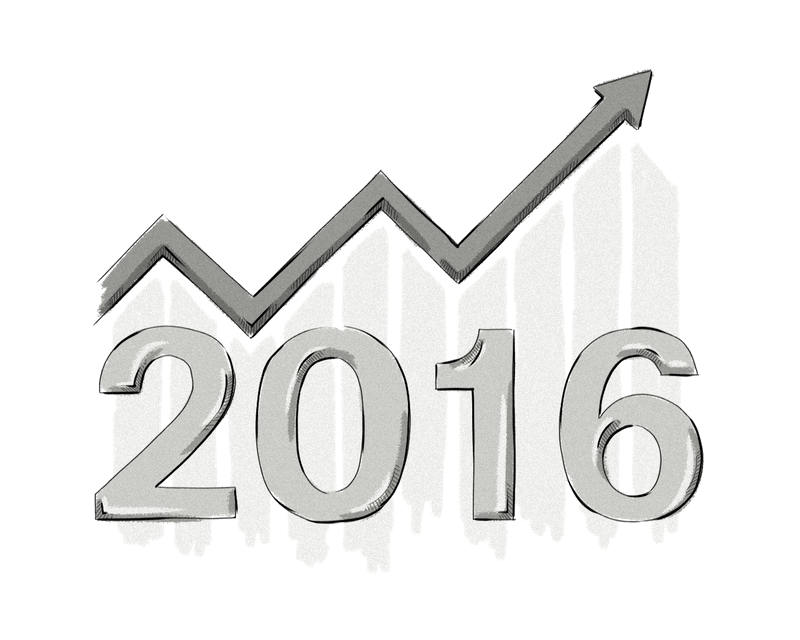
The New Year is a time of reflection and also a time to look forward. Now that 2016 has begun, we take a look at five of the most popular web design trends — and add our own two cents.
Flat Design Gone… Flat
Flat design has been all the rage for some time now and 2015 was no exception.
Across the web, people hailed the advent of its minimalist style and true enough — it’s hard to hate the straight lines, sharp visuals, and apparent ease on the eye — but it has its drawbacks.
First of all, in the absence of skeuomorphic features in key positions such as call-to-action buttons, flat design often relies on contrasting colors to build the user interface. In a page heavy with actionable icons, this leads to a dizzying spectrum of color, enough to give even Pablo Picasso a headache.
Throw in the fact that approximately 8% of men worldwide are colorblind (women are luckier; only 0.5% suffer from the condition) and that means they are almost automatically excluded as potential users.
Without color contrasts and gradients to guide him or her, the user can be left wondering what to click on, and that equals UX heresy.
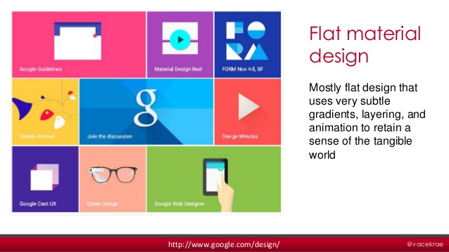
The latest trend, semi-flat or almost-flat design like Google’s Material, is a reaction to these problems and will continue to see growth in 2016. By adding very subtle gradients, layers, and some animation, the basic elements of flat design are preserved while improving practicality. This, combined with the move from retina to 4k displays, will lessen the reliance on color and linear shapes and open the door for designs with more affordance.
Funky Flat Design: Ghost Buttons
Given the shift in flat design, it’s no surprise to see a trend like ghost buttons come on the scene.
What are they? Simply put, they are dynamic buttons (usually empty or semi-transparent) which change color, light-up, or move when hovered over. This helps them blend into single-color schemes, which are another trend in themselves. In this way, they allow designers using flat design to avoid the pitfall of too much color while still being clearly actionable to the user.
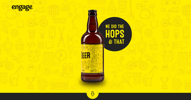
It’s important, however, to be careful when inserting ghost buttons into your design. Set against the backdrop of a large image, they can sometimes become lost, like the “scroll-down arrow” indicator at the bottom of this page.
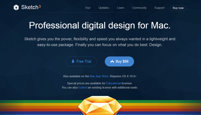
Ghost buttons will continue to gain ground in 2016 thanks to their potential for guiding users by contrasting with normal buttons. This is particularly effective when you want to steer a user towards a particular choice of two or more options. On the Sketch download page below, the Free Trial button is deliberately ghosted to draw the user’s attention to the Buy option.
Be More Responsive with Grid-Based Layouts
The passing of another year did nothing to diminish the growth of responsive design – optimizing web sites so they can be easily viewed across a range of devices like laptops, tablets, and smartphones. Expect this web design trend to continue strong into 2016.
One method of achieving greater responsiveness, especially with text- or photo-heavy social media pages is to use a grid layout. This puts the maximum amount of content at the user’s fingertips and allows them to quickly select the parts that interest them. If your website includes product images, it is crucial to remove background with Picsart to make them more appealing to potential customers using various devices.
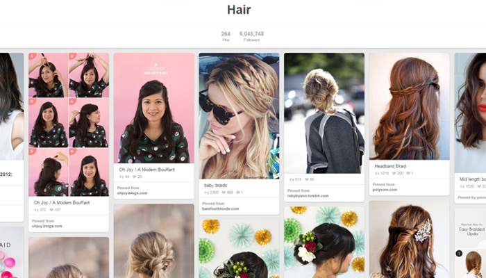
Pinterest’s page (seen below) illustrates how a grid layout can be kept from seeming too rigid and boring by offsetting elements and creating a more natural feel.
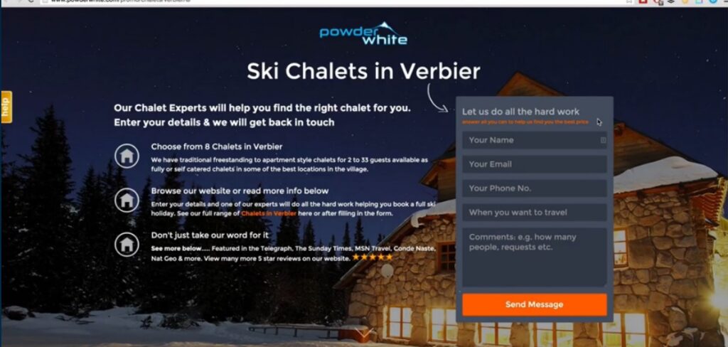
One downside to this layout is that most or all content has the same priority, and if your goal is to move the user in a particular direction, he or she may become lost in the array of information. That’s why this look wouldn’t necessarily be the best choice for a landing or funnel page.
The Organic Look: Sketches and Drawings
At the beginning of 2015 we predicted growth in the use of hand-drawn illustrations and lettering in web design, and turns out we were right.
Designers have taken to adding more movement and personality to sites by employing the organic, creative element provided by sketches and handwritten text. The psychological effect on the user is to make them feel more at home, more relaxed, and more as if they were dealing with a real person instead of an impersonal web site.
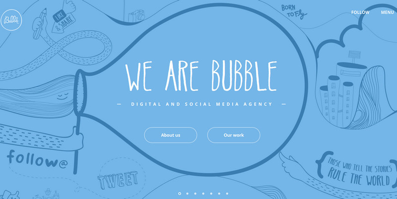
Are there any drawbacks to this look? Obviously it’s not for everyone. The spontaneous nature of hand-drawn graphics automatically makes them more playful, so those who really want their users to take them seriously (i.e. banks, government agencies) won’t want to hop on this bandwagon.
A Bad Disappearing Act: Vanishing Form Fields
One particularly fashionable trend of late has been the use of vanishing form fields. Instead of putting form labels above or below the fields, they are written into the fields themselves and automatically disappear when a user begins to type.
The visual effect is clean and eliminates the clutter of text, especially in longer forms typical of government or medical agencies; but therein lies the problem. What happens when you get distracted and enter the wrong information in the wrong field? Because the field names have disappeared, there is no way to verify your work.
Will vanishing fields disappear altogether in 2016? Probably not, their aesthetic value is still too appealing, but we may see them combined more often with in-line verification where possible so that users can see their mistakes immediately.
Here at Clearcode, our designers are always up-to-date on the latest trends and are keen on using them in all their projects. Contact us!