When it comes to building software solutions, not all apps are created equal, nor should they be.
Different applications are used by different people and this has a major impact on the design of the User Experience (UX) and User Interface (UI).
One factor involves the difference between consumer-grade software and enterprise-grade software. What differentiates the one from the other? What elements figure into the UX and UI design process?
Let’s take a look.
Commercial-Grade Applications: Built for Everyone
All About the Audience (Part 1)
In designing applications aimed at a commercial audience, it is important to remember that theoretically anyone may use them – or no one, depending on the app’s ability to engage the user and solve his or her problems.
For this reason, app developers must not only consider users with varying levels of tech awareness and expectations, but also ways to connect with them emotionally, making them more likely to become loyal users. These methods may include:
1. Using color schemes to create a positive attitude towards the products or services being offered. Single-color schemes combined with subtle shades and variations are often used this way with the added benefit of creating brand identity. (Consider Dropbox’s blue and white look, or Viber’s deep purple.)
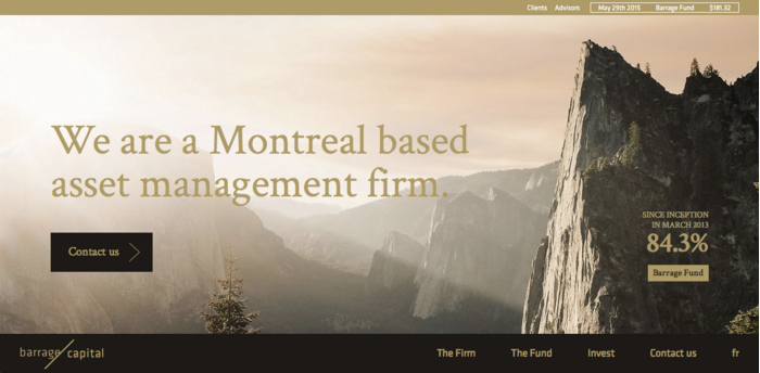
2. Employing a range of graphics/images to engage the user emotionally. This may include large background images, from nature for example, to create a feeling of calm, and in the case of BarrageCapital (below), imply trust and security.
Also, hand-drawn sketches and fonts can be used to “humanize” the UX and suggest a stronger connection to the real world.
Because commercial applications must be designed for a wide range of potential users, interfaces have to be understandable for all, especially first-time users. The key words here are discoverability and learnability – can a new user find what he or she needs with minimum effort and is the application designed so that its features can be learned quickly?
The answer is not always affirmative.
These issues can be addressed by making buttons clearly actionable, which may influence their design and color (so-called “flat buttons” with no color gradients are often not clearly actionable); including extra text for explanation or instructions and various techniques for guiding users on specific pathways; ghost or empty directional buttons; locking levels to prevent users from moving to another step/option until they have dealt with a previous one; and storytelling.
The range and placement of potential options are also affected. User behavior and preferences may vary greatly, thus more options have to be available up front, at least until the user has the opportunity to set his or her preferences manually. At the same time, the interface must remain simple enough to be used by novices. This may involve complex solutions like progressive disclosure or simpler ones like hover buttons for less-frequently used options.
Need for Speed
In contrast to enterprise apps, the majority of which are still aimed at desktop users, commercial applications are going mobile en masse. (Read Gartner’s predictions for mobile use by 2018). At the same time, many applications, especially web-based ones, have to be scalable for both mobile and desktop. This puts responsive design at the top of the list of considerations when building a commercial app.
The problem is that users want speed from the apps they use no matter where they are. In fact, QuickSprout estimates that a one-second delay in loading time reduces an application’s conversion rate by as much as 7%. That means an ecommerce site grossing $100,000 per day could lose approximately $2.5 million a year in sales.
Given the above, designers must choose how to optimize their apps for both mobile and desktop use while keeping their users engaged and happy. Conditional loading is one approach to this problem. By loading images through CSS, or eliminating images altogether in favor of style changes like gradient fills or rounded corners using CSS3, it is possible to reduce the number of HTML requests and speed up loading times.
Of course, this could risk oversimplifying the interface or changing it so significantly that users who move between desktop and mobile become disoriented and disenchanted.
Enterprise-Grade Apps: Functional but Friendly
All About the Audience (Part 2)
The UX and UI design of enterprise applications are also determined by the audiences they serve.
While a commercial app must take into consideration a whole range of possible users – some with advanced technical skills, some who are only concerned with using one aspect of an application, and others who never use anything but a mobile device – software built for enterprises is tailor-made, not only to the needs of the company as a whole, but also to the individual roles of each set of employees within the company.
The implications for UX and UI designers are clear: they have a “captive audience” whose skills set and roles are clearly defined and whose expectations are easier to anticipate and meet.
Now instead of designing an interface with an array of options and features, it is possible to present only those which are necessary to complete the task required. The information architecture of enterprise-grade software is more complex than commercial counterparts, and the databases being used can be vast.
However, because designers have the benefit of knowing specifically who they are designing for and what tasks each user will want to do, building pathways is easier. Creating a system of logins and permissions based on each employee’s needs allows information to be segmented, thus increasing usability.
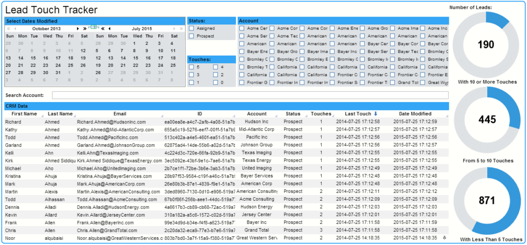
Often, enterprise apps require collaboration between users, something less common in consumer applications. Information sharing must be structured so that each user has easy access to what he or she needs, while ensuring that security is not compromised. A Customer Relationship Management (CRM) platform, for instance, may need one section for use by employees who work directly with customers, as well as a dashboard where cases and/or problematic issues are posted for managers to review.
Similarly, an Enterprise Resource Planning (ERP) application may involve a large number of users who are responsible for resource distribution, but also users whose job it is to procure supplies. Distributors may need more direct access to data such as resource location, while procurers should receive alerts when supplies run low. All of this requires careful planning by designers to ensure a smooth UX for both groups.
Fast, Friendly Functionality
Enterprise-grade software isn’t built to appeal to its users’ emotions or keep them as clients, but that doesn’t mean designing the UX and UI shouldn’t be carried out carefully.
First and foremost, users of enterprise software expect it to function smoothly so they can get their job done. Part of making an app functional is defining what tasks will be performed and what data is needed, as discussed above.
Another aspect is the repetitive nature of these tasks. On the one hand, designers can improve the speed and functionality of the UI by using common default settings or form fields that are filled predictively, eliminating manual navigation, and using automatically-filtered databases based on the nature of the task being performed.
On the other hand, designers face the challenge of creating not only a functional UI, but also a pleasant overall UX. This can be accomplished in several different ways, including:
1. Using elements of gaming to make repetitive tasks more interesting. Users who must complete several steps in a process see a fun, progressively changing graphic that maps their progress. More complex tasks may be framed as “missions” with different levels to overcome. Users gain points or other incentives based on their performance and the results are displayed among team members using a public leaderboard.
2. Personalization. Nothing makes doing repetitive work even more mundane than feeling like a robot in a factory. Designing the application to be personalized by its users (adding a profile picture, setting background images, color schemes) creates a feeling of greater control and, ultimately, less frustration.
History in the Making
Because enterprise applications have the advantage of a captive audience, it is even more essential that they be designed with a user-centered approach.
Part of this means structuring the UI to fit the roles of the users. It also means learning a little history, both about the users and what tools were used to perform tasks the current application is being designed to do.
Since most people know how to use the internet, it is reasonable to build a UI that uses internet-like navigation (browser-like windows with forward/back buttons for instance). Windows users will be accustomed to minimize/maximize buttons on the right-hand side of the screen. Younger employees may be more inclined to use gestures on a touchpad to navigate while older ones may prefer keyboard shortcuts. All this has to be taken into consideration.
When building a solution that completely replaces another one, it is essential to analyze the UI of the older system to ensure that the new one will not greatly complicate the process. If employees have used Microsoft Excel to record data in the past, it would be logical to design a UI that builds on this experience. The simple fact that users will be building on users’ prior experience goes a long way to making the UX more favorable.
UX/UI Design: All Things Considered
Both commercial and enterprise applications present their own sets of challenges for designers. Some areas overlap, while others pertain exclusively to one or the other.
Because enterprise software is much more complex, it often requires a more labor-intensive process to build, and given ever-changing user needs, companies may need constant updating and modification.
For this reason, many enterprises are choosing to move away from designing and building their solutions in-house and turning to independent software houses to meet their needs. Their wide range of resources and dedicated teams allow for the careful needs analysis, which is necessary when dealing with a clearly-defined audience.
This is also facilitated by the trend towards cloud-based software solutions (also known as Software as a Service – SaaS) which allow for easy scalability and real-time updating. All this is very good for business.
Do you have an idea for an enterprise-grade application? Are you unsure what features to include and how to scale it to your audience’s needs? Download our whitepaper below to learn more about building enterprise-grade Software-as-a-Service.